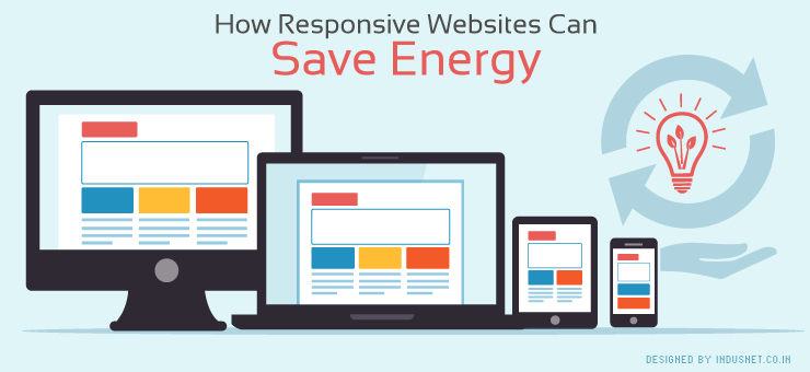
Most people today access the internet through their mobile devices, because of which there is a growing need for responsive websites. A responsive website automatically changes its layout based on the screen size of the device from which a user is visiting a website. This means a responsive website can easily switch from a desktop, smartphone and tablet screen without a designer having to develop separate mobile and desktop websites.
It is also a well-known fact that responsive websites load faster, leading to less consumption of energy. In fact, responsive websites ensure that people who use mobile phones do not need to wait for a longer time for pages to load. When pages take a long time load, there is the obvious battery drain, which forces users to charge their devices frequently, leading to an unnecessary expenditure of energy. This can be prevented if one adopts responsive websites.
How does a responsive website prevent battery drain?
Using responsive design helps in increasing loading time, reduction of error pages and also presenting information with more clarity. People tend to spend more time on a website that is designed for a website but is being used on a mobile device. This does not mean that they are browsing effectively or that they are responding to your call to action.
Instead, it only means that they are finding it hard to understand the layout of a desktop website on a mobile screen, leading to frustration and even boredom. This not only leads to unnecessary use of precious energy but you may also lose prospective clients because they were tired of searching your website for the information they wanted on a small screen.
A responsive website, on the other hand, makes it easier for people to view information easily and thus, they will be more amenable to respond to call to actions. This also indirectly means that they will use less energy and charge their cellphones less frequently. This theory may sound a little offhanded to you but a number of industry observers have noted that responsive websites lead to faster loading of pages and less energy consumed.
It is also a well-known fact that responsive website and apps consume less battery while they are working in the background. On the other hand, a legacy website requires excellent 3G or 4G connection in order to load faster. If the user is located in a place where the connection is not very strong, his or her device may try very hard to find signals, which also lead to the expenditure of battery power.
The future is certainly responsive
More and more companies have begun to understand the positive ramifications of using responsive websites. Not only does a majority of traffic come from mobile devices, but they are also more efficient as web pages. They are power efficient, speed efficient and also energy efficient. Efficiency is hardwired into responsive websites and this is probably why most clients prefer to have responsive websites, even when they understand little about the actual technology behind them.
With a growing concern about green technologies and energy efficiency, companies will understand that responsive websites also provides them a way to ensure that they are environment-friendly. This is an indirect effect of the fast loading pages and something that has already been verified by many researchers. Certainly, responsive websites are not just for different screen sizes but also about reducing energy consumption and going green.