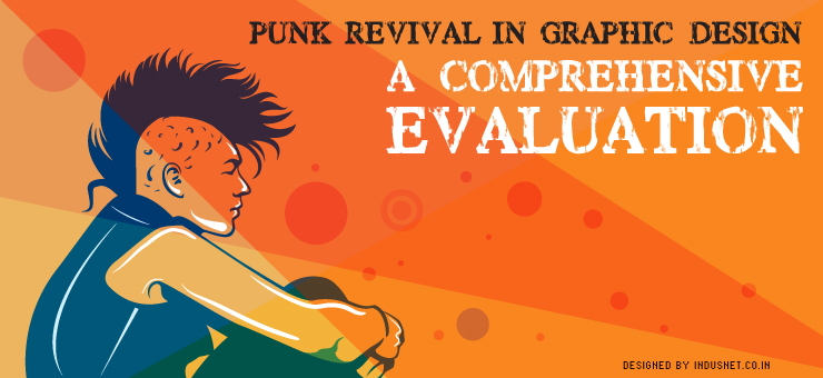
When the punk movement happened in the 1970s, people mistook it to be just another youth movement that was trying to rebel against existing norms. Others confused it with a working class subculture that promoted violence and radical thinking. People were of course mistaken.
The history of punk movement
The punk movement was a reaction to existing artistic sensibilities, which included an elitist attitude among the design and art community. Punk identified with the common and the working class & tried to rebel against the oppressive elitism of upper classes. Artistically, it was postmodernism in disguise. Just like postmodernism, punk was a reaction against modernism, staidness and propriety. While punk music was just one aspect of the punk movement, a larger part of the punk movement consisted of graphic designing. Typography, in particular, came to be influenced by punk ideas.
For instance, the DIY nature of many bands’ album covers, including that of the Sex Pistols, was an initial reflection of what the punk movement was doing to graphic design. Today, punk revival is happening in a slow yet steady manner. Most graphic designers agree that a lot of emphasis is given to ‘corporate’ typography, being perfect, being trustworthy and other platitudes. What the punk revival is going to do to graphic design is something that most people do not understand. In this article, let us try and see how you yourself can be a part of the punk revival movement in graphic design.
Kitsch
Kitsch was deliberately and professionally produced bad art. This provided a sense of satire and cynical pleasure by taking a stand against professional art. Likewise, you might want to create ‘kitsch’ yourself, when you try to create graphics. Of course, this has to be discussed with your client and if the client is a creative-type, they will probably want to experiment with kitsch. Kitsch, for the sake of art, is good but actual kitsch isn’t.
Retro design
In the perfectionist world that we live today, graphic design techniques that were in vogue a few years ago go out of fashion within no time. Why not challenge the norms by reviving retro Internet fonts and designs? Create graphic works that reflect the initial days of the Internet; probably from the 1990s. It brings back a sense of nostalgia while trying to rebel existing norms. It might sound funny but retro can be very rebellious. Not everyone expects to see something from the 1990s, especially, when we are moving and hurtling towards future at a breakneck speed.
Shocking design
In today’s hyper-connected world, it is becoming increasingly difficult for graphic designers to shock their viewers. A little brainstorming and a loosening up of your own professional inhibitions might help you to create something shocking. Shock yourself before you try to shock someone else. However, shocking does not mean offending people. Do not ever try to offend anyone with your professional work. That just doesn’t work.
Collage
Combine various forms of graphics to create something unique. Take parts of designs from previous projects that were not sold and try to make a collage of your professional failures. The end result can actually be something very successful. Collages are very artistic and can convey meanings that we didn’t even intend to, in the beginning. Imbibing collage in graphic designing can have a very surprising result when the project is complete. It is never a bad idea to be experimental, if the client is willing to be experimental as well.
If you are a graphic designer who is looking for various options to be different and trying to carve out a niche for yourself, you might want to read a lot about the history of punk movement. It is a very surprising movement with a lot of inspiration for those who are seriously into creating art, be it graphic design or music or painting. If your clients are the creative type and are looking for ways to be different themselves, have a word with them and enquire if they are willing to engage in some punk revival techniques. Chances are it might even help your client to become successful because of the attention your graphic design is going to give them.