back
Logo Design: What Goes in Making a Good Logo?
Design Reviews Web design

Logo Design: What Goes in Making a Good Logo?

By Mainak Biswas March 06, 2012 - 1,522 views

Most designers encounter clients who need logos to be designed for them. Though a logo is a tiny piece of art, it carries more weight than reams of pages.


What Is a Logo?

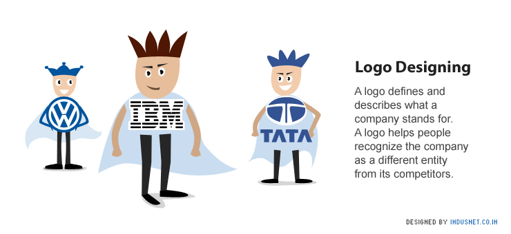
A logo defines and describes what a company stands for. A logo helps people recognize the company as a different entity from its competitors. It inspires trust, familiarity, loyalty and a certain sense of superiority. It helps define a company as a separate commercial, legal and economic identity which has a place of its own in the world.

The shapes, colors and fonts used to create a logo are always different from every other logo that has been designed. Thus it is no surprise than many companies sue each other when their logos appear similar. While a logo does not directly market or sell, it identifies the company as a commercial entity and its products as being separate from others in the market. One could say, that a logo is a signature of a company.

What Makes a Good Logo?


There are several ways to make sure that a logo is exceptionally good. A good logo has to be graphical in nature, and minimalist. A simple design always attracts and holds more attention than an intricate design that requires greater span of attention. A good logo has to be appropriate for the audience of the company’s products and services. It also has to be distinctive and practical.

Logos may have to be printed on a number of merchandize and thus they have to be simple, accurate and easy to recognize. Any logo that is good has an implicit meaning or a message that is conveyed in a unique unstated manner. Even without colour, a logo should be able to stand on its own just because of its shape. It should be designed in such a manner that it can be replicated in any size that the company wants to. Thus, a good logo comes with a good concept and good execution.

The Process of Logo Designing


Designing a logo cannot take place haphazardly. It requires a certain discipline and the ability to stick to a process.

  1. The process involves a design brief, which involves interviewing the client and asking them to answer questions. This may include such elements as what meaning they try to convey through their logo, what the company’s goals, beliefs and ethics are all about.
  2. Once the brief is ready, it is time to do the research. A research must include deep insight into the industry that the client belongs to, and the company’s history and also its competitors.
  3. Having a reference, which is usually cultural in nature, is always good. Logos should be consistent with contemporary themes and beliefs. It should be recognizable as defining a certain quality.
  4. Once all this is done, designers could begin with the actual process of sketching and conceptualizing. Once a logo has been conceptualized, it can be sketched and created on the computer.
  5. In between the logo designing process, one needs to wait and reflect on what has been done so far. It allows the designer to think, introspect and come up with newer ideas or ameliorate what has been done already.
  6. This step leads one towards revisions and positioning. This helps in explaining the logo to the client, and also building lasting relationships with them.
  7. The best logos can then be presented to the client in PDF format or in any manner that may be convenient.

Logo Designing Principles


While this process is common to all kinds of logos, a logo designer must also bear in mind that the profession of designing logos stands upon certain principles. These principles can be understood in the following manner:

  1. Simple: A logo must always be simple, and should have minimalist sub-themes. It should not cause cognitive dissonance among the target audience and should be clutter free.
  2. Memorable: A logo should be remembered easily. It should have geometric and recognizable patterns so that the company can be easily associated with the logo and remembered as well.
  3. Timeless: Though a logo should be contemporary in nature, it must also be timeless. This only means that shapes and patterns that are chosen must be consistent across classic and contemporary periods. It always helps to be a little conservative when it comes to logo shapes.
  4. Versatile: A logo has to be adaptable, and should be able to fit in any place it is printed on.
  5. Appropriate: It goes without being said that logos should not be profane or provocative. They should not hurt anyone’s sentiments and should be neutral in nature. It should also be appropriate for all sections of the society.

BTW, If you have a logo to be designed, feel free to drop us a line and we will be happy to connect you with our Logo Design team.

Page Scrolled