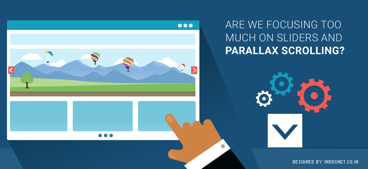
A lot of web visitors often find it strange that every website these days comes with parallax scrolling and slider images. While these techniques are excellent for most visitors, certain people who are not used to image-rich screens feel alienated. People who have been using the Internet for decades and are used to textual content, often find it distracting to see images that slide and change. They also find it difficult to scroll down for all the information.
What a web designer must consider
If you are a web designer and were wondering if you should omit the parallax and slider features, think about it this way. Who are your target audiences’ and what do they want? No wonder that the Internet is changing and a lot of us will want to get our websites designed in a manner that is more in sync with our times. However, we may end up alienating certain niche groups that prefer to have a more text-based website that does not have parallax features.
There is also another side to this story. Many newer web design companies and rookie designers go for parallax scrolling because that is the template you most often get. This calls for a completely different solution, which is, customized development based on client requirement.
A lot of clients actually do know what they want and if someone is trying to shove parallax templates down their throat, it is easy to see why: parallax and slider templates are easily available and they are the “in” thing now. It is easy to alter these templates a little bit and sell it for a premium to the client. This is not only professionally lazy but also unethical.
It is all about custom development
One needs to understand that each design has its place. Parallax and slider features work well with a certain kind of web user. For another, it may be important to have the good old textual website that is more accessible. Understanding who is going to use the website and continuously customizing one’s website is the only solution. If we simply ignore sliders and parallax features just because they are too common today, we may risk alienating younger and trendier audiences. Thus, it is important to understand the target audience and come up with a design plan that is customizable in the future and now.
Always remember to consider who needs what
Parallax websites are great for companies that offer a few services or products. However, if your company is really huge, it might be a better idea to incorporate certain elements of old fashioned heavy coding. Moreover, sliders can be incorporated or discarded based on your requirements. The only way you will ever know if you should go for sliders and parallax scrolling or a more conservative design is by speaking to professionals who are well versed with advantages and disadvantages of both styles.
If you have budget constrain, you could try and opt for a template that will suit your purpose. Otherwise, it is a better idea to choose customized web development solutions that will help you to maximize your web traffic and reap profits in a better fashion. At the end of the day, purpose of a website is to help you gain useful traffic that will convert to sales. For that to happen, it is always advisable to focus on a website that is designed specifically for the target audience.
There is no such thing as parallax is not advisable or that sliders are a distraction. It is the purpose of the website that is more important. Web developers and clients must consider all these aspects before deciding on a course of action. If you need assistance, you could always speak to one of our professional developers who will be able to guide you.