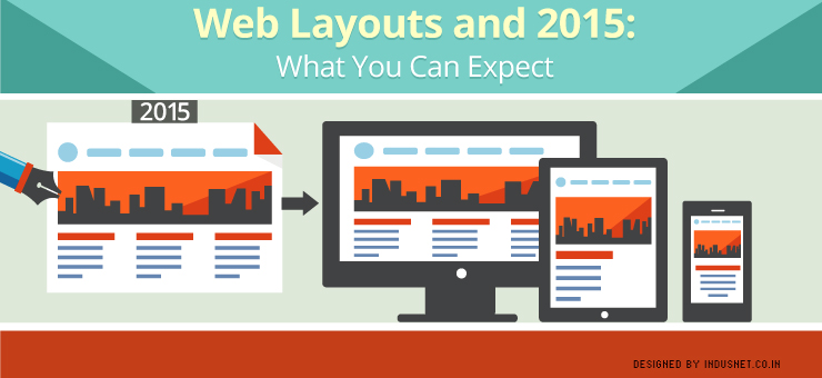
A web layout helps the reader to locate information on a screen in a way that is cognitively helpful. A web layout should be chosen in such a manner that the desired content is available to be read in an easy and intuitive manner. In fact, much of web design layouts focus on how to make information visible in a way that is not only aesthetically pleasing but intuitive for the web user to find.
Intuitive design is an important part of web layouts and that is something that one needs to consider while choosing a layout for a website. Back in the 2000s, there were very few web layouts available and every website looked quite similar. However, with the advent of different screen sizes and different devices, the need for different kinds of web layouts only grew in importance.
Today, most of the people use web layouts that are responsive in nature. These layouts automatically adjust to the kind of screen size and device that a user is using without having to prompt the reader to choose a “mobile-friendly” website or a full “desktop-version”. In this article, let us take a look at what we might foresee in the future when it comes to web layouts and their application.
Layouts are going to get more flexible
This year, we shall see many changes within the various formats of web layouts. Most importantly, they are likely to grow flexible. There are several more devices and screen sizes than there were last year. This means, there will need to be even more flexibility within the layouts.
Flexibility will not be restricted to just the structure of the layout but also the functionality of a layout. We are likely to see layouts that have different functions within themselves and those which can easily be customized or changed, depending on our changing business requirements.
Layouts will be more intuitive
Intuitive design is going to get a lot more important. Though originally assumed to be Apple’s domain, most device manufacturers are focusing on intuitive design. With that in mind, we need to design web layouts that are intuitive too. Depending on the kind of content and the device from which a person is browsing, the layout must be able to adapt.
This intuitiveness will prove to be an important factor in judging the value of a web layout. Most responsive layouts today are already intuitive but they will begin to get more amenable to the idea of being more visceral.
Layouts will become more design-oriented
Layouts had always focused on functionality. They focused on how best information could be placed so that content could be found easily while browsing. Now, we are moving towards a more intuitive aspect of web layouts.
Even so, design is going to find more prominence in the coming months. Just having an intuitive interface will not suffice. A design must stand apart from its competitors and be able to grab the kind of attention that makes it possible to attract more leads. Being design-oriented along with being intuitive and flexible will help websites to consolidate their position and relevance through 2015 and beyond.
Moving away from templates yet quite not
We are going to see more number of web designers moving away from rehashing existing templates and choosing to design original layouts from the scratch. While this may help some people, it may also be unnecessary at times. There is already a number of layouts that are based on existing templates.
These templates are future-proof and there is no reason why everyone must start designing layouts and templates from the scratch. Thus, for some people, using existing layouts may work and for others, starting from the beginning may help. It depends on what the client is looking for.
Final thoughts
Web designers must incline towards the idea of intuitiveness and intelligent design. Moreover, layouts that are flexible will likely dominate the year because of the number of devices that are around in the market. Additionally, using pre-existing templates is not a bad idea as long as it satisfies the requirements. Changes can be made to existing templates and a new design can be built over the skeletal layout. On the other hand, building a template using a layout that is quite radical and disruptive can be an option as well.