M-commerce websites have become the norm when people sift through various options in making a well-informed purchase. As this trend is growing day-by-day, many brands have come up with innovative ideas to lure customers into their net. With the cut-throat competition that these websites are privy to, a web designer has to make sure that his work does not raise questions about its usability.
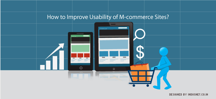
Making your M-commerce website usable
M-commerce has a whole lot of potential and this is clearly manifested nowadays in the tremendous growth this field of marketing is exhibiting. It has exhibited an 86 percent growth rate and has hit $25 billion in 2012. It is also expected to reach $86 billion by 2016 according to experts.
Here are a few common usability mistakes that you as a website designer can be expected to commit.
1. A home page difficult to scan for users
The home page that you often select as the landing page is the main thing responsible for the users to develop an image of the website. Once they land on it, they can build an image regarding the work of yours in their mind and you will have to leave no stone unturned in making it a pleasant experience for them while using it. This experience can translate into a profitable venture for you.
According to a study, more than 70 percent of the first time users who land on a website avoid returning to the site because of the difficult-to-scan nature of it. If the home page and its links are displayed on an endless page there can be less chances of your m-commerce website translating into purchases or more visitors. As they say, ‘first impression is the last impression’.
2. Not well-sorted items or options
As there is no freedom of creating a website with an endless list of products or links, it is better advised to categorize the products or the information in certain comprehensible and well-fitting groups. Also, the resolution with which the website is compatible with should be paid much attention to. The size of the font too should make the letters discrete and the length of the page being limited, an attempt should not be made to go the landscape or horizontal way. It may appear too cluttered.
Drop-down menus and hover-cards can do the trick in settling this issue with page length. The former can go to great lengths and this is not restricted and the latter should be very informative and be displayed in a patch of contrasting color with the background. A black and white combination is always good for such kind of display items.
3. Having too many visual elements
This is a blunder that even a quality brand website is privy to. There should not be a lot of highlighted options in the face and many users at the receiving end of this are not amused. They develop a spammy kind of feeling towards this website. This trick of marketing should instead be compensated by special offers categories that display freebies along with irresistible offers. People do not turn away from really irresistible offers. This should be bore in mind.
4. Giving less importance to privacy of the users and ease of information availability
As M-commerce stores involve the transmission of a great deal of private and confidential information such as the purchase of the product, much emphasis has to be laid on the privacy of the user. The users need to be directed to a separate page in order to transmit the information to the merchant, but this should be done on the same consolidated page without taking much of their time.
If they lose their already typed information because the page could not communicate with the server or it takes a large chunk of their valuable time because of DNS errors, they may get annoyed. This can also solve the problem of re-typing the information on the keypads that proves daunting.
Also, it is always advised not to redirect users to a new window and all of the information should be as far as necessary displayed in the current window itself. This should be done to facilitate the users not only in handling credit card information, but also during furnishing other details regarding their location or advanced search queries.
Users are a lot akin to filter their search using a lot of keywords and once these categories are not displayed in the same window itself or the primary search, they may move to other websites for the information. There are other websites that have a large bit of information readily available at hand.
We would like to discuss a case study that describes how even well-endowed individuals have faltered. This downturn of events can provide you with a vague idea of the perils in store when a website is rendered unusable.
Case Study:
Mr. ABC, a freelance web designer, suffered consequences when the website he designed was plagued by usability issues or more precisely, privacy issues. This issue was the main culprit for causing him to lose his much important clientele.
After quitting a job in the corporate world where he earned a decent salary, he developed a liking for independence: he decided to go freelance. His clientele provided him with work and there was no dearth of it. His work was commendable and he became the most sought-after web designer.
He was a man of dogged perseverance and proved a hard taskmaster for his subordinates. This charismatic man built a reputation among his clientele that was purely by his own sweat and blood. All this reputation was dented with a single negligence in the work of his.
Problems relating to the usability aspect started cropping up in the numerous websites he designed and the rapport he had with his clientele took a severe beating. An anonymous hacking group that was into ethical hacking and believed in creating awareness among website users took over a popular website he had designed to highlight the loopholes in the security and privacy of the users.
Thus, the privacy of the user was at stake and this did not go down well with his website owners. They complained about this to his clients and this created much furor among the latter. The website owners were not amused and became disinterested in the quality of work he provided.
He decided to improvise, but it was too late- he lost a large chunk of his clientele. There were a huge number of websites he designed and optimizing them was an impossible task. His clients dwindled down to a few numbers too because of such a lack of professionalism- as they construed. While a lot of his clients moved to greener pastures, a few of them decided to stick to him. This was because he optimized their websites and never left anything for them to complain.
The number of his cherished clients dwindling, his business was never the same as before. This issue with privacy ended in him losing his stature in the society and he was look down upon by a number of his admirers and acquaintances. He did not adapt to this change in their demeanor and he could not come to terms with his fate as to how it played games with him. If the whole thing was nipped in the bud, his business would have remained buoyant and free from these issues. He should have exercised caution.
Conclusion
A lot of users develop a kind of revulsion towards the overall m-commerce thing as the keypads are not as friendly for typing as the PCs. This thing should be taken care of and the furnishing of information again and again or covering the whole screen of the mobile device using hover-cards or pop-ups should be avoided.
The screen being very small, other valued information can be left hidden from the user’s eye. It should be noted that the mobile device is different from the PC and all the things suited for the PC environment are not welcome here. There can be a lot of crossed lines and confused feelings if this side of the bargain is not taken care of. Increasing the usability of an M-commerce website ensures that products are sold quickly, and your clients will make more money. This will help in ensuring that your clients keep coming back to you.