A new research by Canalys revealed that global smartphone shipments overtook client PC sales. More people bought smartphones that ran on iOS, Android, BlackBerry OS and Windows Mobile OS than they bought personal computers in the form of desktops, laptops, netbooks and tablets.
This leads one to believe that Internet traffic will be driven by smartphone users and websites need to be mobile device optimized now, more than ever in the past.
Until now, web designers concentrated on designing websites that were well-suited to open flawlessly on major browsers. With the increase in smartphone-driven Internet traffic, web designers need to make that webpages are compatible with different mobile devices that run on complex mobile operating systems. Thus, mobile development is cross-platform and cross-browser at the same time. With serious bandwidth, screen-size, platform and interface deficits, mobile devices present challenges that were unknown to web designers of yesteryears.
Here are 10 important aspects to keep in mind, while optimizing webpages for smartphones.
Precision of Content
Precision of content is an important feature a web designer must keep in mind while designing mobile-optimized websites. Reduced screen size and lower resolutions mean that each pixel is valuable and only relevant content must be optimized. Low priority content can be hidden or removed altogether. Images and videos must be optimized to suit a small screen and content must be very focused. Horizontal scrolling must be avoided and as much as possible, vertical scrolling must be used.
Single Column Layouts
As the screen size is reduced, users would have to skewer their eyes in order to be able to read text comfortably. Even when the text can be maximized and increased in size with the help of zoom, users would not like it when content appears in two or more columns. Thus, it is very important that vertical scrolling and single column formats are adopted.
Interface and Navigation
An intuitive mobile website renders information in the least confusing manner and the lowest number of clicks and taps possible. Making sure that there is always a search box near the logo on the landing page allows users to type keywords and retrieve information intuitively.
Curtailing Text-entry
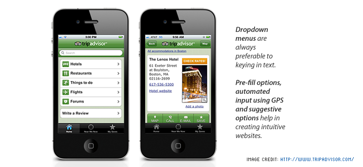
Dropdown menus are always preferable to keying in text. Pre-fill options, automated input using GPS and suggestive options help in creating intuitive websites.
Parallel Versions of Mobile Websites
While most smartphones today have a good resolution above 480 x 800, there are older cellphones which have screen resolutions of 128 x 160 pixels. A mobile website that is designed for a larger resolution screen will never look tidy or synchronized on a screen with a smaller resolution. As a designer, one may have to design parallel versions of mobile websites for lower and mid-level resolution screens.
Touchscreen and Non-touchscreen Devices
With an increasing number of people using touchscreen-only devices, web designers might be tempted to design sites that are touch-optimized. Doing so would alienate users that still use certain models of smartphones by BlackBerry and other companies, which sometimes have QWERTY keypads and no touchscreens.
Location Tracking
Optimizing a website to track a user’s location can give valuable information to owners of the website. This information is usually used to help users discover things and people nearby that matter to them. It may also help in driving contextual content to a user’s screen.
Communication
It is important to make sure that communication takes place effectively and intuitively in fewer numbers of clicks and taps. Telephone numbers on the websites must be enabled to be dialed directly, and clicking on email addresses should direct the user to email applications within the smartphone.
Social Media
With the advent of social media, website designers should design sites in such a way that content can be shared across Twitter, Facebook, Google+ Tumblr, Reddit and other social bookmarking and networking sites.
Minimalism
A web designer must always try to keep information, content, media and even design to the bare minimum. When there is very little real estate available, space is very valuable and that is just the case in mobile websites.
As of December 2011, Android devices held 47.3% of market share, Apple’s iOS held 29.6% of market share, RIM’s BlackBerry OS a share of 16%, Microsoft’s Windows Mobile has a market share of 4.7% and only 1.4% of smartphone users used a Symbian device. Web designers would however need to keep in mind that all of these operating systems are equally important and while designing a website, one must optimize sites for every major platform.
We, at Indus Net Technologies can help you optimize your website for smartphones or develop one from scratch. You can get in touch with one of our consultants at info@indusnet.co.in or http://www.indusnet.co.in/mobile/